Client: Unilever
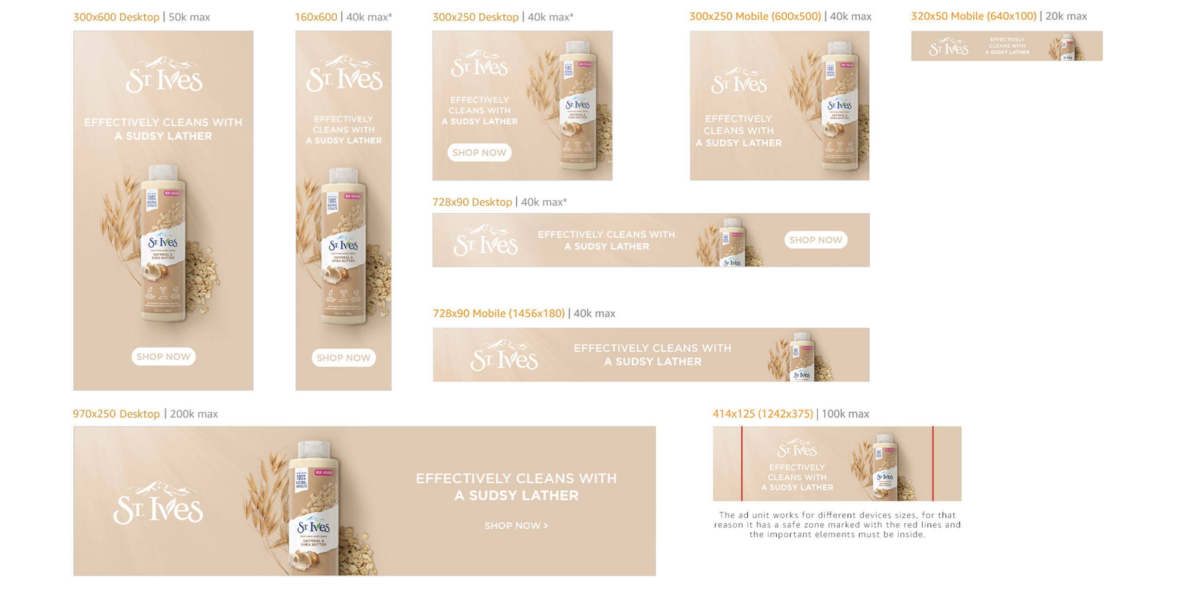
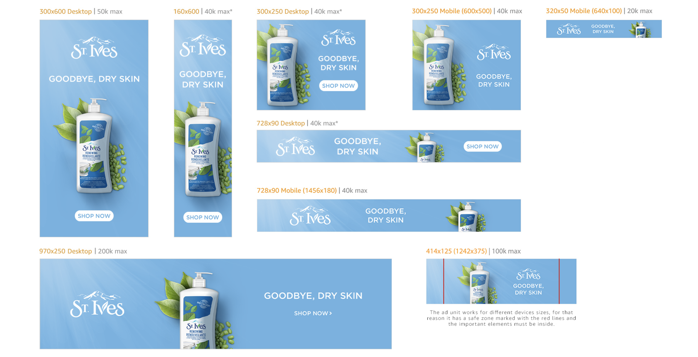
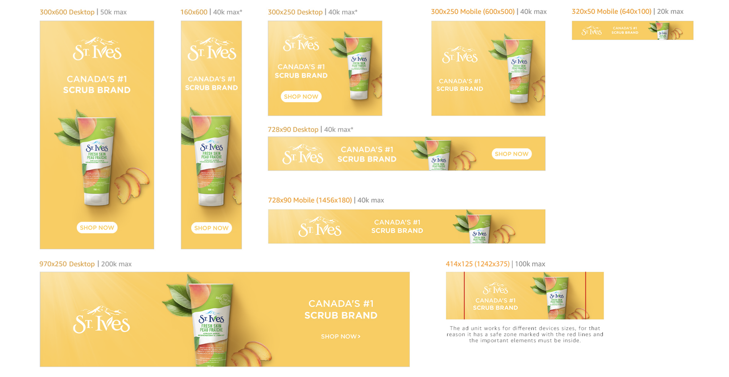
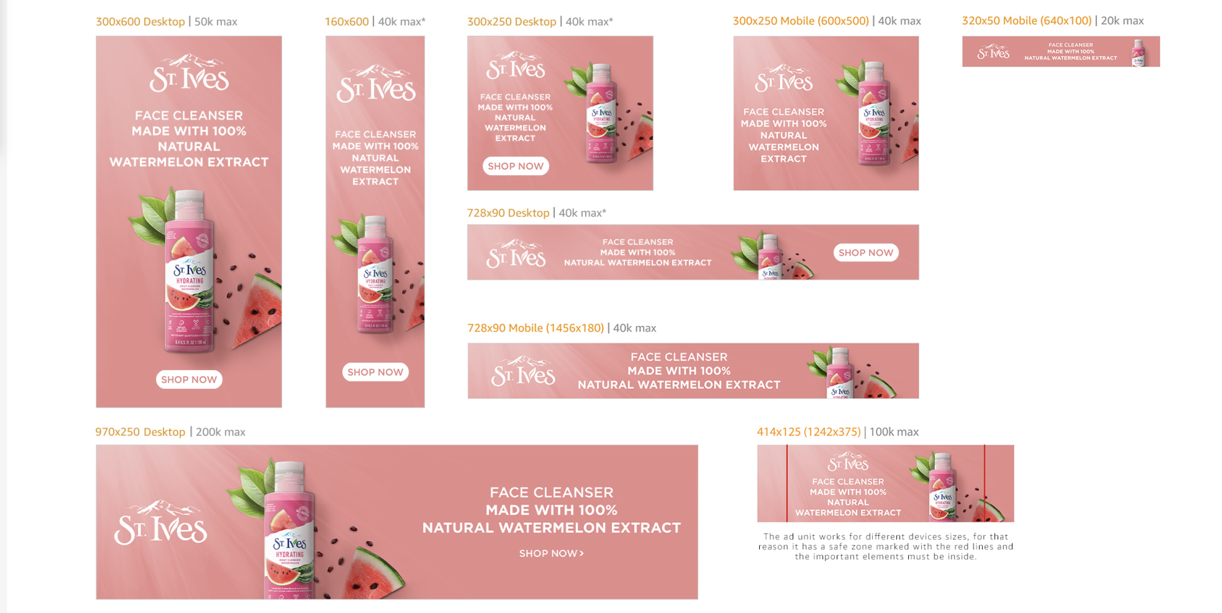
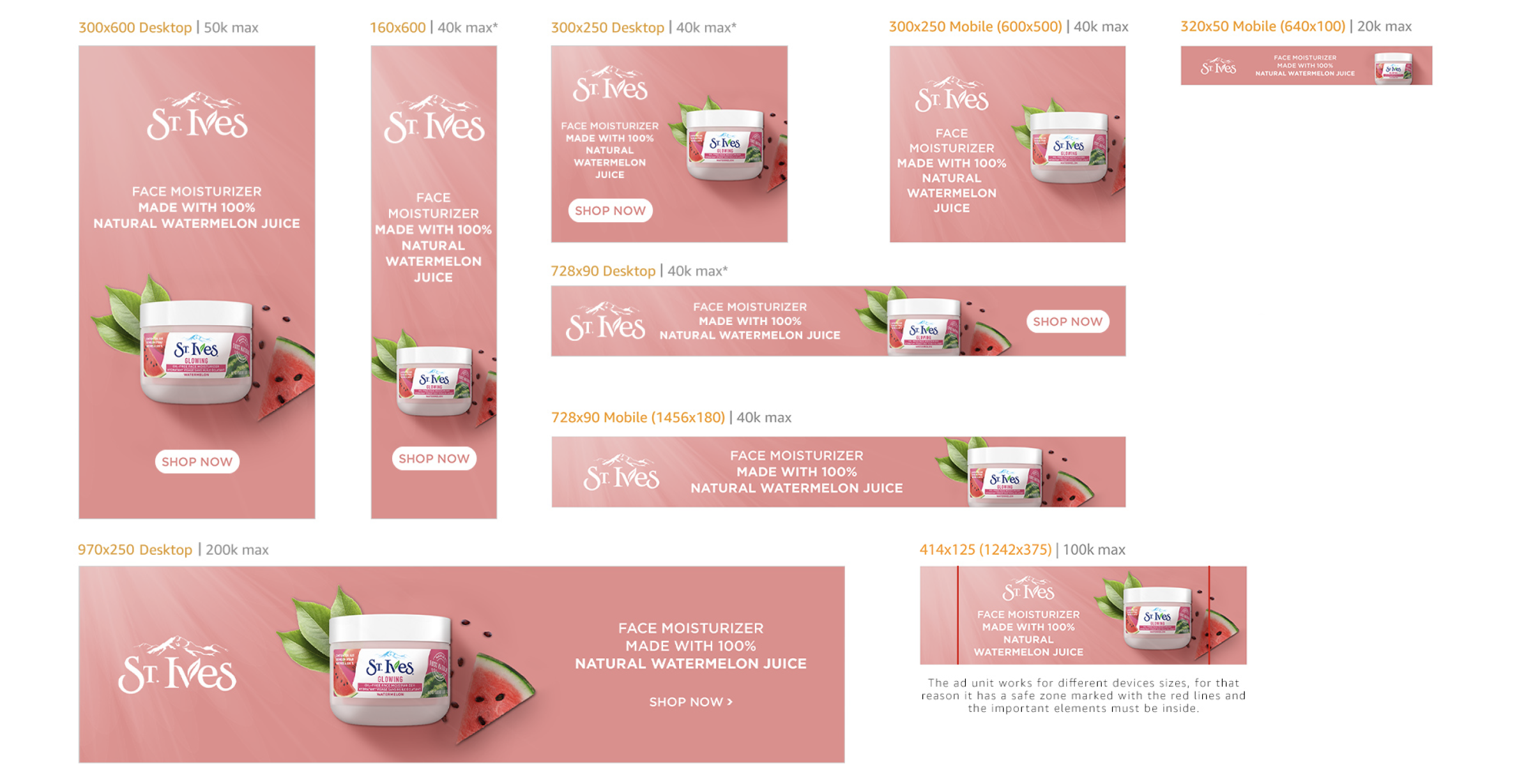
Only having the copy and the product I created the concept for five different versions, all 5 versions were completely different amongst themselves, different products, ingredients and details in general, this meant I had to look for all the variations of the products, cut them and adjust their perspectives to have a realistic view of the product, for all this I researched about the brand and different design styles that can be used with these types of products. The concept was synthetized through representing and giving the appearance of daytime, with the rays of light; since in general these products are used during the morning. To reinforce this feeling each shadow is well positioned in such a way that it will make the consumer think of shadows casted by an intense sunlight, I also decided to add the ingredients of each product making them more attractive and letting the user know what aromas to expect when consuming the product. The selection of the background color was based on the product’s most eye-catching color, this means that the overall design gave a feeling of being monochrome and avoided including other distracting colors to give a cleaner look. Regarding the alignment choice and reading hierarchy it is organized in such a way that the user’s or consumer’s attention will be initially caught by the product.

